OVERVIEW
We provided content & design recommendations to make the act of booking care easier.
What we did:
• Updated the contact form with research-backed microcopy.
• Simplified/streamlined the act of booking care.
• Infused all new content with a consistent and reassuring tone.
BEFORE
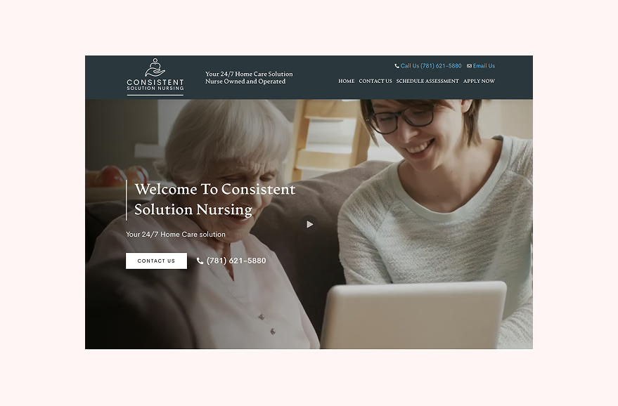

AFTER
• Testing showed confusion over where to click to book care. We reduced the amount of CTAs and updated the content to better reflect where each would take the user.
• We also updated the header to better reflect what the company provided.
BEFORE

• Lack of microcopy left user confused and unsure of what to do.
• On the product side, this form led to inconsistent and missing information for the owner.

AFTER
• Updated microcopy guides user through the booking process, providing a timeline, contact preference, and option to get in touch now, all user needs that we uncovered in our research and testing rounds.
• What’s not shown here:
We designed a verfication screen that informs users of next steps.
We updated the error messages to be targeted to the specific problem.